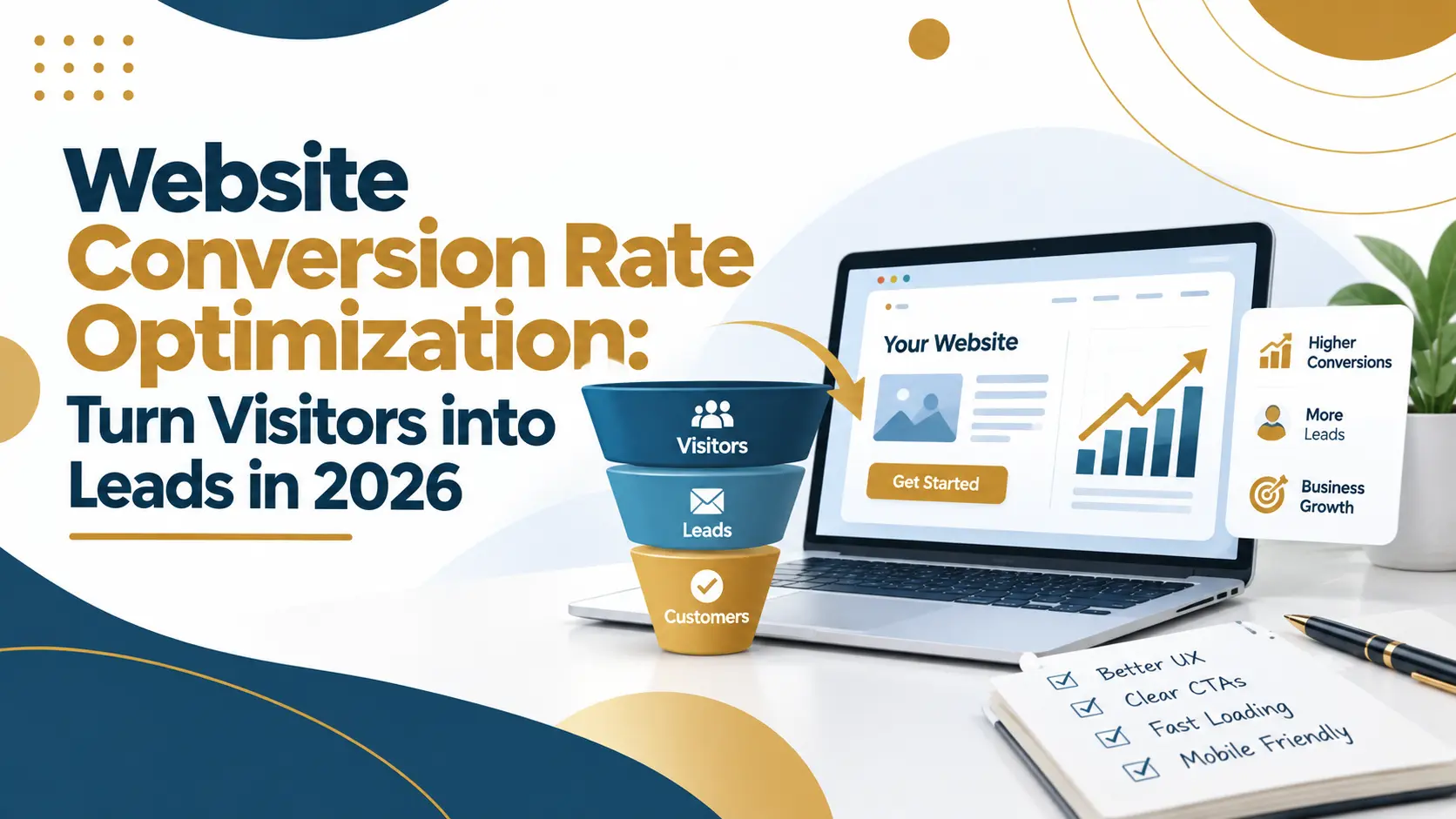
Website conversion rate optimization (CRO) means improving your site so more visitors complete a desired action (such as submitting a form or requesting a quote) without increasing traffic. In practice, CRO involves clear landing pages, compelling calls-to-action (CTAs), simple forms, fast mobile-friendly pages, trust signals, A/B testing, and reliable conversion tracking.
What Is Conversion Rate Optimization (CRO)?
Conversion rate optimization (CRO) is the process of making strategic improvements to a website so that a higher percentage of visitors become leads or customers. Instead of only focusing on attracting more visitors, CRO asks: “How can we help existing visitors take the next useful step?” This means guiding the right visitors smoothly to actions like filling out a contact form, booking a consultation, or making a purchase.
1. Optimize Landing Pages Around One Clear Goal
Each landing page should have a single, clear purpose and make it obvious to visitors what your business offers and what they should do next. A high-converting landing page typically includes:
- Benefit-focused headline: E.g. “Website Design & Marketing Support for Growing Businesses.”
- Brief explanation: Clear summary of the offer or service.
- Relevant visuals or examples: Images or graphics showing your work or product.
- Trust signals: Client testimonials, case study highlights, or trust badges.
- One primary CTA: A prominent button or link.
- Simple enquiry process: An obvious, short form or contact method.
Make sure the most important information is above the fold and easy to find. If your site needs a redesign, start by reviewing pages that already get relevant traffic – small improvements there can yield quick gains. Our SEO-friendly website guide explains how good site structure supports both search visibility and user experience.
2. Write Clear, Compelling CTAs
A call-to-action (CTA) tells visitors what to do next. Generic CTAs like “Submit” or “Learn More” can be unclear. Instead, use specific, action-oriented CTAs that set expectations. Examples include:
- Request a Free Consultation
- Get a Project Quote
- Discuss Your Website Needs
Put each CTA close to the relevant content (e.g. after a service description) and design it as a noticeable button with contrast. Avoid multiple competing CTAs on one page; a single primary goal per page leads to higher conversion rates. Always explain what happens after clicking (for instance, “We will review your information and get back to you within one business day.”).
3. Simplify Forms to Reduce Friction
Lengthy forms are a common conversion killer. Ask only for information you truly need to follow up. For many businesses, a simple contact form with fields like Name, Email, and a Short Message is enough.
| Field | Recommendation |
| Name | Required |
| Email address | Required |
| Message/Project Details | Required (short text box) |
| Phone number | Optional (if needed for follow-up) |
Use clear labels and validate entries to prevent errors. On mobile, ensure inputs are easy to tap and fill out. After form submission, show a confirmation message so visitors know their enquiry was received.
Test whether each field is essential. Fewer fields often increase submissions, but more fields (with the right audience) can improve lead quality. The key is balancing form completion rate with lead qualification – always measure both.
4. Improve Page Speed and Mobile Experience
Slow or clunky pages drive visitors away before they convert. Focus on performance, especially on mobile:
- Core Web Vitals: Google’s guidelines define good thresholds: Largest Contentful Paint (LCP) ≤ 2.5s, Interaction to Next Paint (INP) ≤ 200ms, and Cumulative Layout Shift (CLS) ≤ 0.1. In other words, the main content should load quickly, the page should respond promptly to taps or clicks, and layout shifts should be minimal.
- Mobile-friendly design: Use responsive layouts. Ensure fonts and buttons are legible and tappable on small screens.
- Optimize resources: Compress images, minify CSS/JavaScript, and eliminate unnecessary scripts or plugins.
- Avoid intrusive pop-ups: On mobile, modals or ads that cover content can block the CTA and frustrate users.
Use tools like Google’s PageSpeed Insights and Search Console’s Core Web Vitals report to identify issues. Improving speed and usability protects user attention, but remember to measure: a faster page is only helpful if it leads to more enquiries, not just better scores.
5. Build Trust Before Asking for a Conversion
Visitors will give their contact details only if they trust your business. Include social proof and transparency:
- Client testimonials or reviews: Highlight real feedback from customers.
- Case studies: Show concrete examples of your work and results.
- Clear contact information: Provide a physical address, phone number, and professional email.
- Certifications or badges: If applicable (e.g. industry memberships, awards, secure-site lock icon).
- Privacy assurance: Note that you respect privacy (e.g. “We protect your information and will never spam you”).
Instead of broad claims like “Best marketing agency”, give visitors evidence. For example, a testimonial or snippet of a case study near your contact form can reassure a hesitant visitor. For more on building online credibility, see our Reputation Management Guide.
6. Match Pages to Visitor Intent
Make sure each page answers the visitor’s question. A page targeting “website development services” should clearly explain that service and have a “Request Website Quote” CTA. If someone Googled “what is SEO?”, they expect an explanation, not a sales pitch. For paid ads, if your ad promises “PPC services,” link to a specific PPC service page, not a generic homepage. (For background on paid search, see What is PPC and How It Works.)
Align the headline, content, and CTA with the traffic source and keywords for that page. This synergy between SEO (attracting relevant visitors) and CRO (converting them) is key to lead generation.
7. Use Helpful Lead Magnets and Follow-Up
Not every visitor will fill out a form right away. Offer valuable resources (lead magnets) to get contact details without forcing a sales call. Examples:
- “10-Step Website Redesign Checklist” (downloadable PDF).
- “Guide: How Small Businesses Use SEO in 2026.”
- “Email course: Improve Your Marketing Automation in 5 Days.”
After someone signs up, send them the promised material and a friendly follow-up sequence (e.g. one email per week). Don’t overdo the sales pitch – instead, share useful tips and remind them how your services can help. This nurtures leads who might convert later. Learn more in our Lead Magnet Funnel Guide.
8. Set Up Accurate Conversion Tracking
To optimize CRO, you must measure the right actions. Google Analytics 4 recommends the generate_lead event for submitted enquiries or forms. Marking such events as conversions helps you see which pages and sources drive leads.
Key actions to track include:
- Contact button clicks or chat initiations.
- Form starts and successful submissions.
- Quote request completions.
- Phone calls (using call-tracking).
- Qualified leads or sales (if you can connect Analytics to your CRM).
Configure GA4 so that a completed form or booking fires generate_lead. In GA4, mark it as a key event in reporting. Also segment by page, source, and device to find bottlenecks. Accurate data ensures you optimize for real enquiries, not just clicks.
9. Run A/B Tests to Improve Decisions
A/B testing compares two versions of a page to see which drives more conversions. Useful experiments include changing:
- Headlines (e.g. “Request a Quote” vs “Get Your Free Quote”)
- CTA button text or color.
- Form length or fields.
- Page layout (image vs text position).
- Trust signal placement (testimonial above the fold vs below).
How to run a CRO test: Identify a problem (e.g. visitors drop off before submitting forms), hypothesize a fix, and split traffic between the current page and a variant. Let the test run long enough for reliable data (especially if traffic is low) before deciding. Focus on metrics that matter (form submissions, not just button clicks) and watch lead quality.
If your traffic is low, you may rely more on user feedback or smaller usability improvements instead of statistical tests.
Conversion Optimization Checklist
Before publishing, run through this quick checklist for each key page:
- Clear Goal: Does the page have one primary objective and CTA?
- Strong Headline: Is it specific and benefit-driven?
- Persuasive Copy: Does it match visitor intent and explain the offer?
- Visible Trust: Are testimonials, reviews, or case snippets present?
- Actionable CTA: Is the CTA clear, prominent, and contextually relevant?
- Minimal Friction: Are forms as short as possible? Do images and scripts load fast?
- Mobile-friendly: Does the page look and work well on phones?
- Tracking: Are form submissions and conversions being recorded correctly?
Use this checklist after making changes to ensure nothing important was overlooked.
Common Mistakes to Avoid
- Focusing Only on Traffic: More visitors won’t solve problems if your pages don’t convert them. Fix content and UX first.
- Too Many Choices: Multiple CTAs or options on a page can confuse visitors. Keep one clear path to conversion.
- Buried CTAs: Don’t hide your main CTA or put it too far down the page.
- Overwhelming Forms: Don’t ask for information you can collect later.
- Ignoring Data: Always test and measure; never guess what works best.
- Copying Competitors Blindly: Your audience and offer are unique. Use their pages for inspiration, but validate changes with your data.
Turn Visits into Leads
Improving conversion rate is an ongoing process. Start with your most important pages, measure the results, and iterate. Small wins (like a better headline or faster page load) can lead to significantly more enquiries.